Not-for-profit medical cover provider Benenden Health supports over 800,000 of its members with award-winning healthcare services. As part of its ongoing digital strategy with Code’s sister agency EssenceMediacom – research had shown that TV drove significant interest and a desire to find out more about Benenden Health.
Their website is, in the majority of instances, the first point of contact for most users and existing members – so it’s crucial it provides a seamless end-to-end experience.
An on-site survey and homepage analytics investigation showed us what Benenden users were looking for and the journeys they were taking on-site. We discovered that:
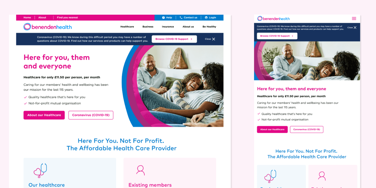
With this in mind, we simplified the homepage into a series of clearly labelled journey entry points – allowing users who land and scroll on the homepage to find what they’re looking for faster and easier.
The experiment resulted in both members and non-members being funnelled into more relevant content sections, whilst also improving the ‘shop window’ appearance of Benenden Health in line with the updated brand and proposition.

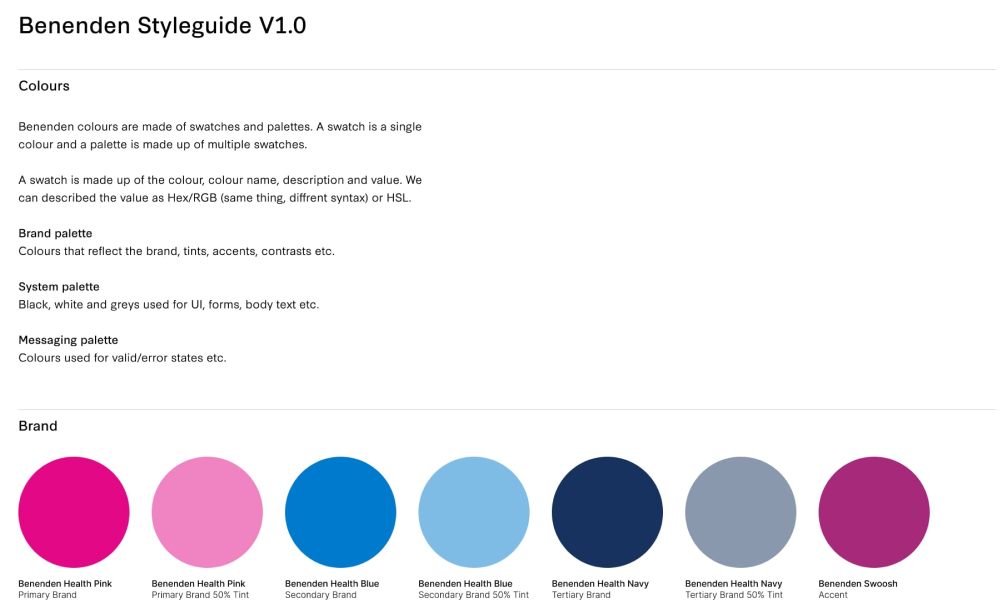
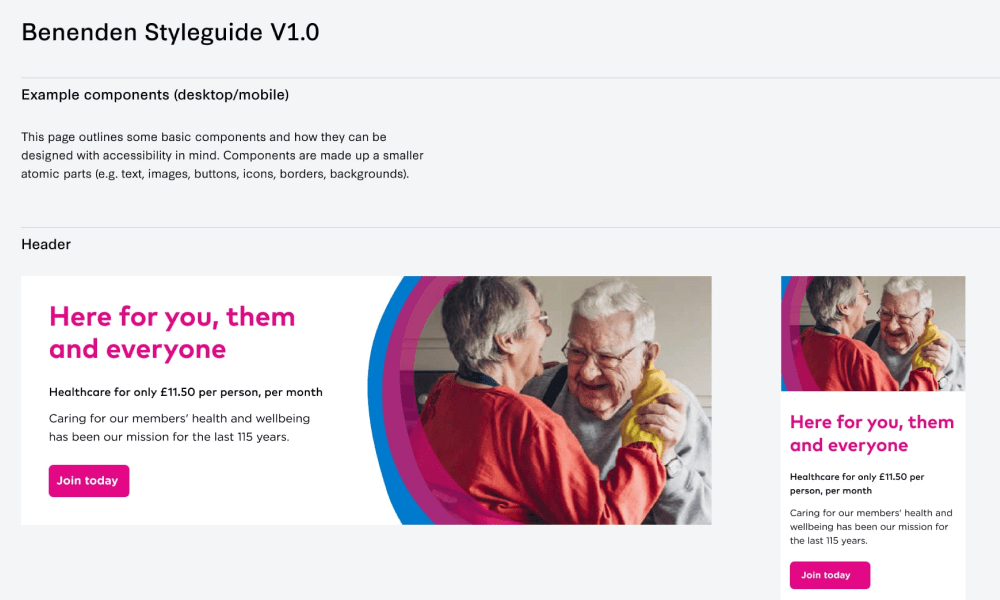
We also created a practical style guide and usage guidelines to help roll out Benenden’s new visual identity across the site, complete with a fresh digital brand and value proposition.


With over 50% of users using the website on mobile, improving page load speed was a priority. To improve performance we ran several audits and provided benchmark metrics, prioritising recommendations that would have the greatest impact on page speed.
Recommendations were fed through Benenden’s IT process and implemented, shaving 6.6 seconds off mobile download site speed on a 3G connection. Benenden also wanted to make the website accessible for all users and become WCAG 2.1 AA compliant.
To help them achieve this, we began work on a thorough accessibility audit to identify key actions and recommendations across the whole site. Following the audit and after applying the identified changes, we were able to increase Benenden’s Google Lighthouse Score for accessibility from 47/100 to 89/100.

Our UX and CRO teams observed that some users were struggling to understand Benenden’s core Healthcare proposition and convert using the join form.
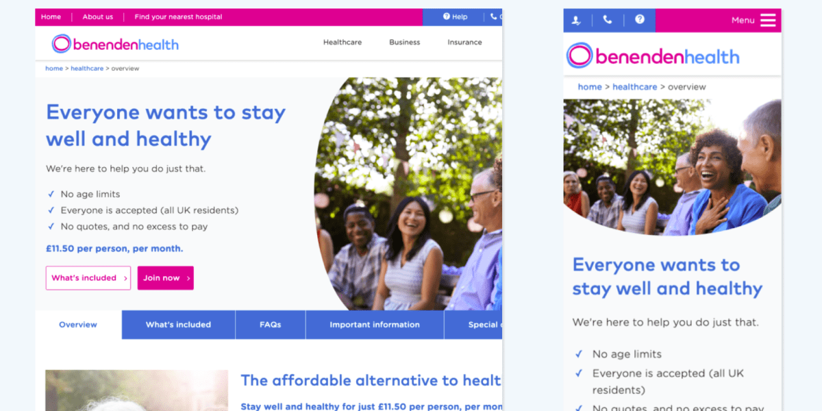
To identify and implement a solution, we launched an A/B test that changed the entire Healthcare section of the website. As part of the test we made usability and accessibility improvements, and also developed a clearer hierarchy of information with greater clarification of the primary Benenden Healthcare offering.
Two different hero styles with differing content were used to help users better identify where they were in the journey and to differentiate from core journey pages to supporting content pages. We also improved navigation, placing content into unique pages as opposed to tabs to improve usability on mobile.