Bruntwood’s journey to a seamless digital identity and customer experience
How might we create a vibrant digital experience for a brand with multiple personalities?
Bruntwood’s recent rebrand had been lacking the connection and translation to their digital platforms.
We were challenged with aligning the different business sub-divisions to one set of consistent digital identities that could be true to their individual propositions but still identifiable to the end customer as ‘Bruntwood’.
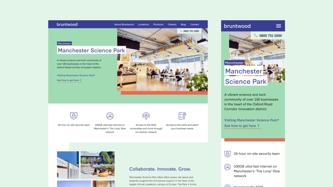
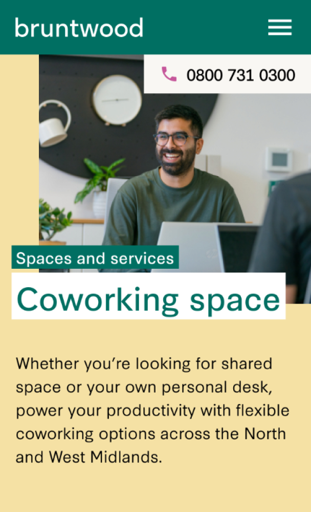
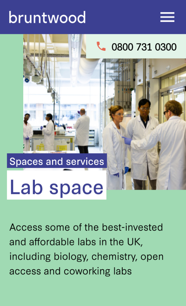
There were a number of microsites, with Bruntwood also having 2 subdivisions each with unique identities, SciTech and Works. Our strategy was one Bruntwood site, organised around property, cluster and campus hubs that maximise the brand story, heritage and seamless customer journey.
We started by creating a design system defined by clear principles around structure, reusability and a shared language of how we talk about styles, components and content. The system meant you could work faster, more efficiently and with consistent brand application.
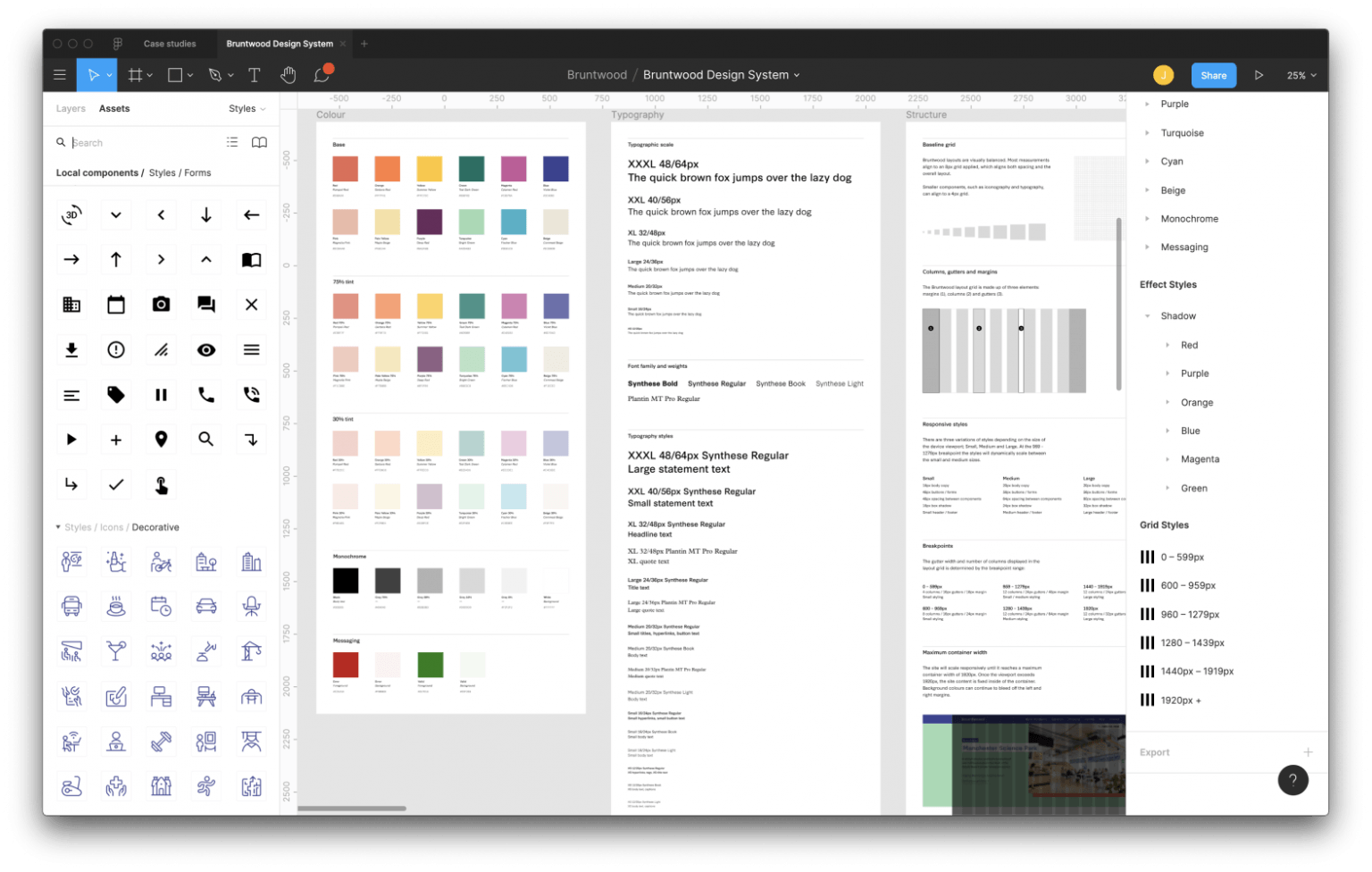
Using atomic design principles we built a system starting with the fundamentals that make up the foundation of the brand (colour, typography, structure, accessibility). We then defined the atomic elements such as buttons, form inputs and icons. These were then used to create larger components which applied the art direction, colour theming and content.
The system is constantly evolving and updated whenever new atoms or components are made. The majority of these components are also built into the Contentful CMS to allow Bruntwood to create their own pages and have future autonomy over the iterative page design process.
.png)
.png)
After the art direction and first iteration of the design system was complete, we started building out page designs working inline with the product roadmap.
Wireframes were prototyped and tested in parallel with building the design system. It was an efficient process to take the wireframes and apply the styles, components and content using the system.

After we designed page templates, we eventually added the Contentful CMS to the platform which allowed Bruntwood to build their own pages, while remaining consistent and adhering to the design system.
This digital re-design has aided the marketing and brand team to be re-aligned on the visual identity, putting customer experience at the heart of the platform to create vibrant, content-rich and consistent experiences.