

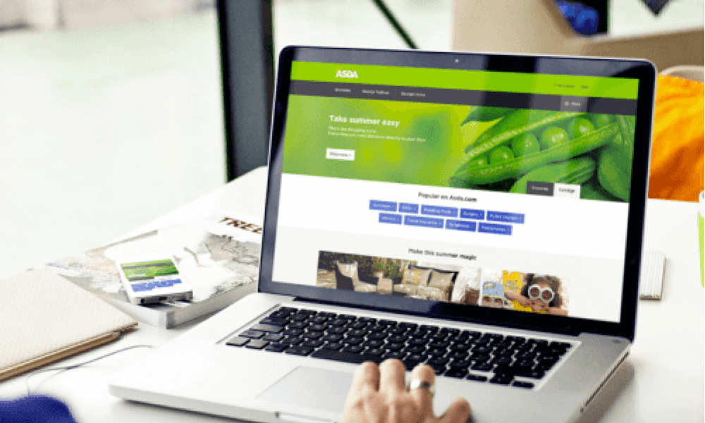
Boosting Asda’s digital presence with UX and product design
How do you help users find a single product, amongst millions, in under three seconds?
With an old CMS, a substandard user interface and a new brand launch looming in line with their ‘Save money. Live better’ proposition, there was potentially a lot for us to change.
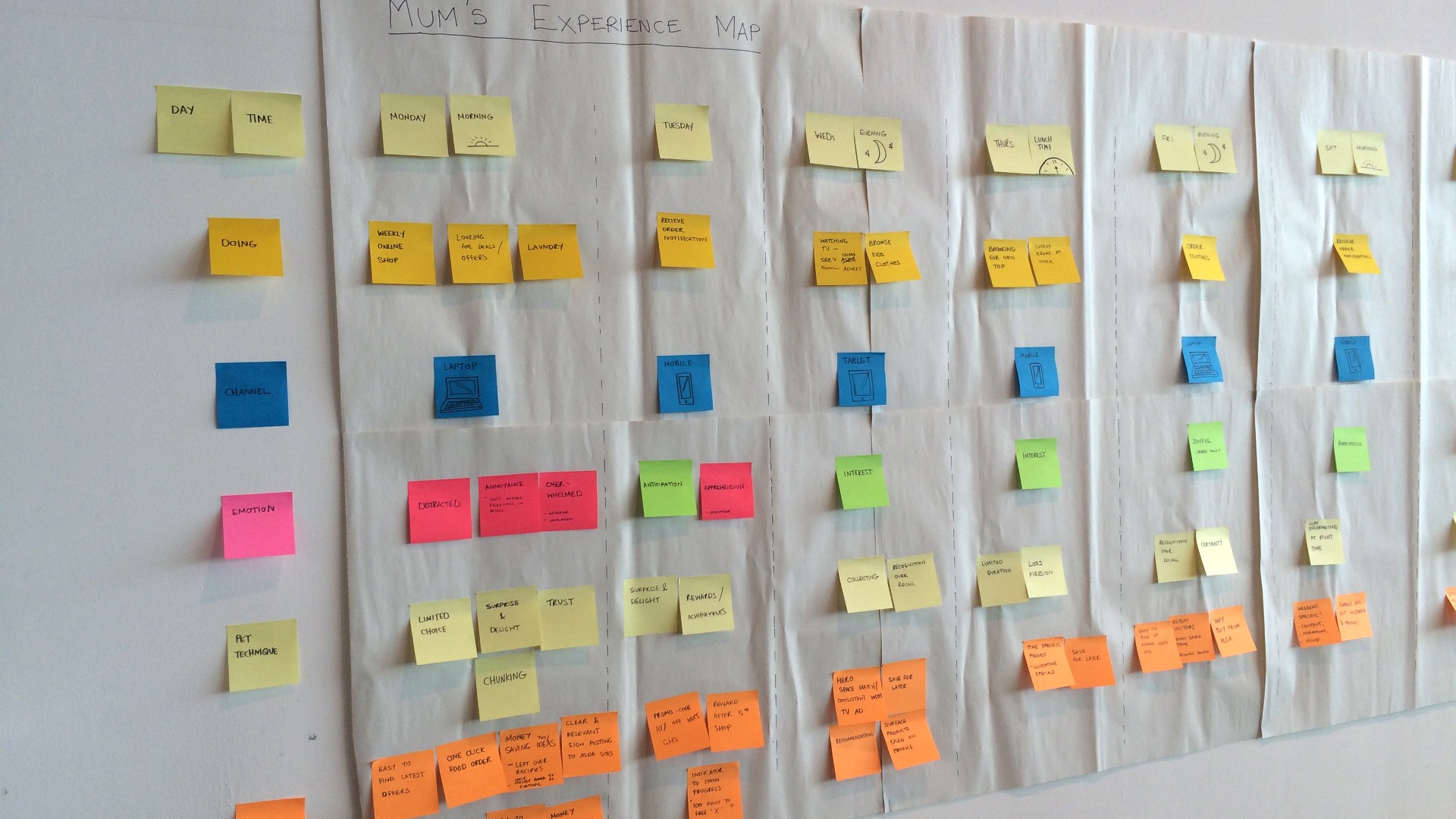
Using a hypothesis gave us a clear goal to work towards and paved the way for an iterative approach to the design.
Instead of starting the challenge with the mindset ‘we need to select a new CMS’, we began by focusing on the customer, by defining what would benefit them the most. This focus was something that all following decisions had to align with. From there we decided what changes needed to be made.
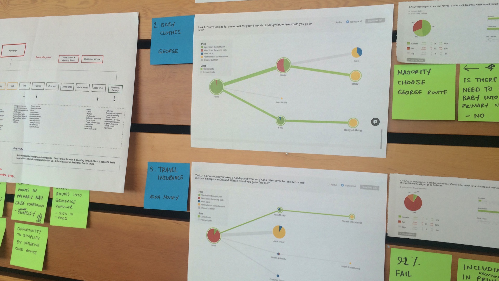
Our conversion optimisation team devised a number of tests to validate this hypothesis. After several rounds of tree testing, the resulting sitemap was used to create new prototypes to test directly in front of customers. Initial results were positive, demonstrating to Asda stakeholders that we could significantly increase click-through rate (CTR) across the majority of products by simply reorganising the way content was labelled and structured in the sitemap.
Speed and performance were fundamental to the site, which was something we would not compromise on.
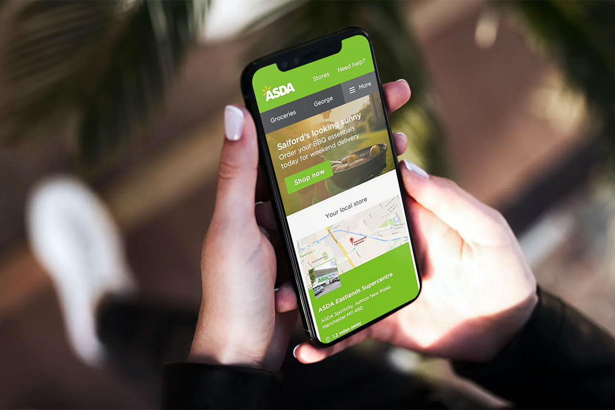
With over 46 million unique users, ASDA.com plays a vital role in the overall experience of an Asda customer. Research shows that if a website doesn’t load within three seconds, the user test is 50% more likely to drop off. Designing and developing Asda.com with performance in mind resulted in extremely fast load times for all users on any device, which decreased the overall bounce rate.
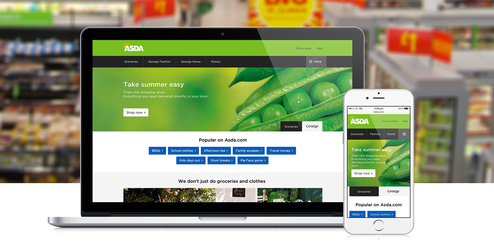
Using the latest technology we built a best-in-class, cross-device digital experience. The responsive site, leverages the browser’s ability to display images best suited to the user’s device, whilst only delivering the resources they need at any one time. A lightweight site also means that if we need to change direction, make changes or improvements then we can do so quickly, without having to uncouple it from heavy-weight systems or coding infrastructures. This was very important for our next dream job: a Star Wars reskin.
We delivered an additional multimillion pound revenue per month. We didn’t stop there, on a weekly basis we are still iteratively testing and refining the navigation to increase CTR to key business lines. This has returned some pretty impressive results.
